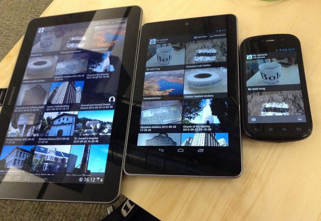
Web pages can be viewed using many different devices: desktops, tablets, and phones. Your web page should look good, and be easy to use, regardless of the device. Web pages should not leave out information to fit smaller devices, but rather adapt its content to fit any device.
Responsive web design is about creating web pages that look good on all devices! A responsive web design will automatically adjust for different screen sizes and view ports. It sets the view port of your page, which will give the browser instructions on how to control the page’s dimensions and scaling.
Responsive web design (RWD) is an approach to web design that makes web pages render well on a variety of devices and window or screen sizes. Recent work also considers the viewer proximity as part of the viewing context as an extension for RWD. Content, design and performance are necessary across all devices to ensure usability and satisfaction.
A site designed with RWD we provide adapts the layout to the viewing environment by using fluid, proportion-based grids, flexible images, and CSS3 media queries, and extension of the rule.

